We began the project with a discovery call with Renseven Group's stakeholders to gain a deeper understanding of their business, operations, and objectives. This conversation was central to shaping the direction of the project:
Target audience — We identified who Renseven Group needed to reach and used these insights to inform design decisions that would resonate with that audience.
Project deliverables — Together with stakeholders, we defined clear deliverables aligned with their business goals.
Milestones and timelines — We established a structured project timeline with key milestones to guide execution and keep the project on track.
Content architecture — We mapped out the site's content structure, ensuring information was organized logically around how the target audience would navigate and engage with it.This foundational step ensured the design and development process that followed was grounded in a clear understanding of the client's business and audience, rather than assumptions.
Using insights from the research phase as our foundation, we translated Renseven Group's positioning into a cohesive visual and structural design.
Navigation & Flow — We created flow diagrams to map out the website's navigation, ensuring visitors could move intuitively from introduction to services to conversion, with clear pathways for their target audience.
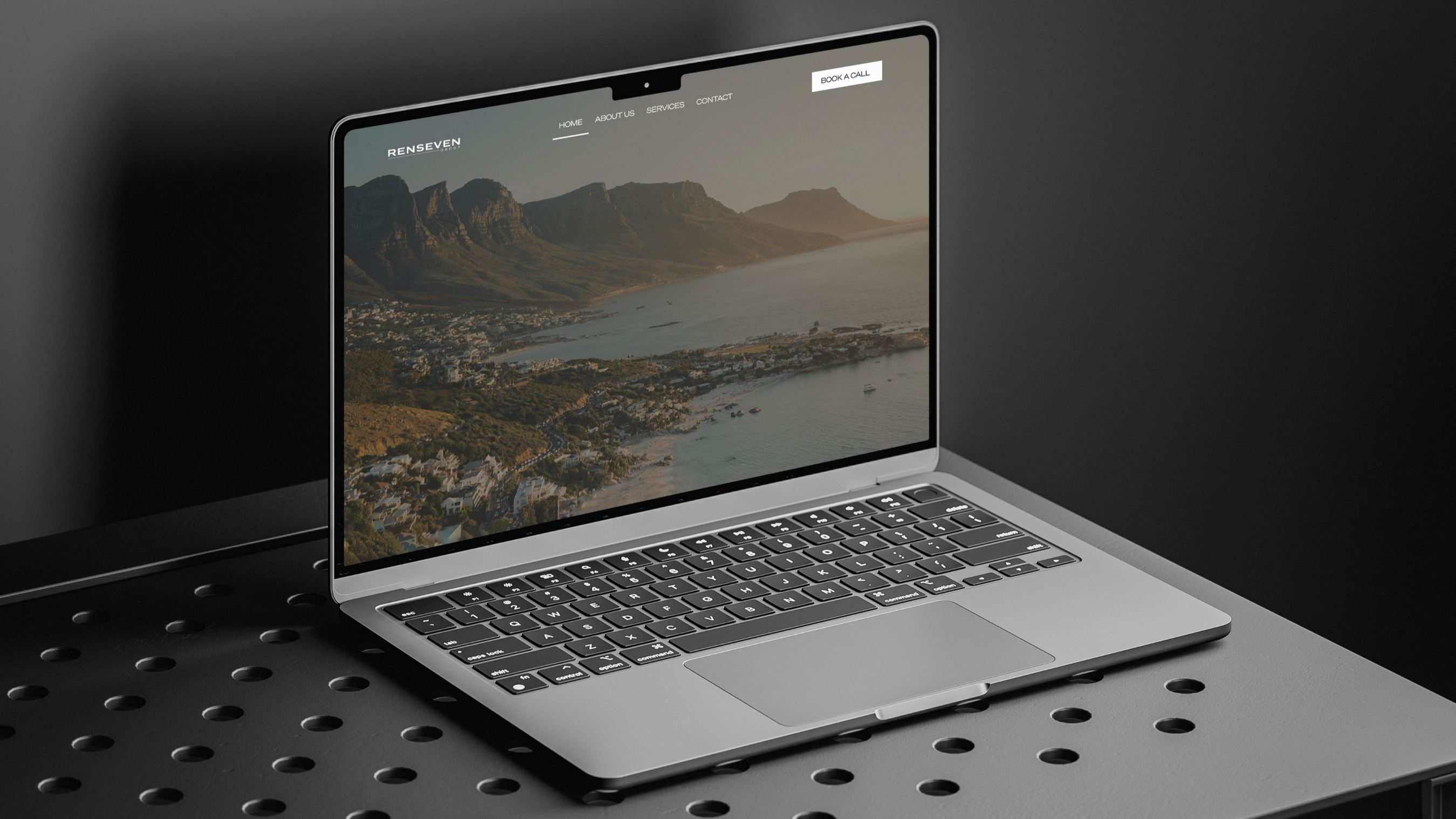
Visual Identity — We developed a visual system aligned with Renseven Group's brand identity, built around a dark, minimal corporate palette with a white logo set against a dark background. This direction was chosen to convey authority, stability, and precision fitting for a company operating across infrastructure and commercial sectors while reflecting their core values of precision, performance, and principle.
Design to Development — We built a website mockup and presented it to the client for review, refining the design based on feedback until it was approved. Once signed off, the design was implemented within WordPress, ready for launch.
This process ensured the final website was both visually aligned with Renseven Group's brand identity and structurally intuitive for their target audience.